Timofey Bordachev: The EU is now dealing with the consequences of its huge strategic failure — RT World News https://t.co/nGpcKfdOsp
— Komrade Deplorable (@astroloupicus) December 14, 2023
Archives
All posts for the day December 14th, 2023
https://www.naturalnews.com/2023-12-13-ai-kill-everyone-extinction-nuclear-weapons-pandemics.html
12/13/2023

In a joint statement released last week, OpenAI head Sam Altman and “Godfather of AI” Geoffrey Hinton warned that the existential threat of artificial intelligence (AI) to humanity is real.
Even though Altman, whose firm created ChatGPT, and Hinton are both profiting from AI, they admit, along with more than 350 other prominent figures, that AI could end up killing off most of humanity in the coming years.
“Mitigating the risk of extinction from AI should be a global priority alongside other societal-scale risks such as pandemics and nuclear war,” the experts wrote in a single, 22-word sentence put together by the nonprofit Center for AI Safety.
As of late, there have been a number of similar types of statements made by promoters of AI, including billionaire electric vehicle (EV) guru Elon Musk, about the dangers of AI. It is a bit strange, but is there anything not strange these days?
Anyway, the one-sentence statement is meant to cover the threat of AI to basically destroy the world through all sorts of calamities, including through the increased spread of “misinformation” and the economic upheaval that will inevitably come through AI humanoid robot-created job losses.
(Related: Woke corporations are feverishly developing genocidal AI robots that will exterminate humanity to halt climate change.)
AI-generated Pentagon explosion photo triggers mass stock market selloff
The world has been getting a steady dose of AI propaganda ever since the release of OpenAI’s ChatGPT product, which allows users to ask all sorts of questions or request proofreading and receive instant answers or revisions.
ChatGPT is basically grooming the general public to accept AI as a normal part of everyday life. Once AI becomes fully normalized, there are sure to be increasingly more dystopian products that come down the pike.
AI-generated photos are also becoming a problem, at least for the establishment. One such photo depicting a fake explosion at the Pentagon triggered a stock market selloff that ended up erasing billions in value from the markets at large.
The Center for AI Safety recognizes that these and other issues threaten to destabilize the planet in many ways, hence why it issued the one-sentence statement in an effort to “open up discussion” about the topic, especially given the “broad spectrum of important and urgent risks from AI.”
Other notable signatories of the letter besides Altman and Hinton include Google DeepMind boss Demis Hassabis and Anthropic CEO Dario Amodei.
Altman, Hassabis and Amodei joined a select group of experts earlier this month that met with President Biden to discuss what “the big guy” thinks about the risks and regulations of AI.
In 2018 Hinton and Yoshua Bengio, another letter signatory, won the Turing Award, the highest honor in the computing world, for their work on advancements in neural networks. These advancements were described at the time as “major breakthroughs in artificial intelligence.”
“As we grapple with immediate AI risks like malicious use, misinformation, and disempowerment, the AI industry and governments around the world need to also seriously confront the risk that future AIs could pose a threat to human existence,” commented Center for AI Safety director Dan Hendrycks.
“Mitigating the risk of extinction from AI will require global action. The world has successfully cooperated to mitigate risks related to nuclear war. The same level of effort is needed to address the dangers posed by future AI systems.”
Altman, meanwhile, has been speaking out in favor of more government regulations to keep AI in check, warning that AI could “cause significant harm to the world.” And Hinton, who has basically devoted his entire life’s work to AI development, now says he regrets it because it could allow “bad actors” to do “bad things.”
More of the latest news about the threat of AI can be found at FutureTech.news.
Sources for this article include:
The formation of a multipolar world is the objective course of history, the Russian foreign minister said
“Is there a single place where the US intervened with military force, where life has become better? I think you know the answer,” Lavrov told the forum participants.

Dec 11, 2023
Russia’s foreign minister, Sergey Lavrov, delivers a video address to the Doha Forum. © AFP / Salim Matramkot
The 500-year-long dominance of the West is coming to an end, being replaced by “a new polycentric world,” Russia’s foreign minister, Sergey Lavrov, said Sunday in a video address to the Doha Forum.
The minister expressed regret that certain “circumstances” prevented him from coming to the Qatari capital in person and hearing the discussions at the annual high-profile event.
“But I assume that you were discussing the multipolar world, which is emerging after 500 years of domination of what we call the ‘collective West,’” Lavrov said.
This hegemony of the US and its allies had been “based on a diverse history, including ruthless exploitation of peoples and territories of other countries,” he said.
According to the minister, the West suggested that it could use the model of globalization, which it had been building for centuries, to maintain its dominance. “However, other countries, using exactly the principles and instruments of the Western globalization, managed to beat the West on its own turf, building the economies on the basis of national sovereignty, on the basis of balance of interests with other countries.”
New centers of economic growth and political influence have been emerging, “changing the balance of power in the world, and not to the West’s liking,” he said.
US exploits its allies – Putin
“In order to suppress this kind of development,” the US and its allies have in recent years “sacrificed” globalization in favor of the so-called ‘rules-based world order,’ Lavrov continued.
“The rules were never published, were never even announced by anyone to anyone, and they are being applied depending on what exactly the West needs at a particular moment of modern history,” he added.
The FM said that such an approach is most seen “in various conflicts, which the West ignites all over the world,” including the one in Ukraine. “Everything goes to keep the hegemony. Intervention in domestic affairs, sanctions against all the principles of competition, regime change, and of course direct military interventions, like we have seen in Yugoslavia, Iraq, Libya, Syria, and elsewhere.”
“Is there a single place where the US intervened with military force, where life has become better? I think you know the answer,” Lavrov told the forum participants.
According to the diplomat, new formats like BRICS, the Shanghai Cooperation Organization, ASEAN, African Union, and others will become “the bricks of the new polycentric world.”
READ MORE: Middle East royal calls for end to Western ‘dominance’
It should be recognized, including by those in the West, that “the objective course of history… is the evolution of a multipolar world,” Lavrov insisted.
I don’t know how doctors can ignore this; it is crystal clear. The slope of deaths per day post-shot goes UP. It is supposed to go DOWN. You can’t ignore this. You can’t explain it.

https://kirschsubstack.com/p/medicare-death-data-proves-the-covid
STEVE KIRSCH
Executive summary
If you do a simple plot of the absolute number of deaths per day after a vaccine shot is given vs. the number of days that have elapsed since the shot, other than for a brief 21-day period after the shot, the number of deaths per day will always monotonically decline over time in a safe vaccine.
But for the COVID vaccine, it monotonically increases over time for up to 365 days straight.
This happens in every country, after every dose that I have data on! That’s stunning. It’s never supposed to go up unless something huge is happening in the background, and even then, it would be time limited.
A positive slope for 1 year post-vaccination is unprecedented. It means the COVID vaccine is killing people. There is no other explanation. Nobody can explain it. Instead, they claim there might be a confounder and that my failure to find a confounder is not proof that no such confounder exists.
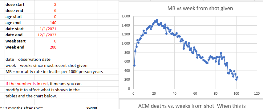
The New Zealand data “smoking gun”
From the New Zealand data time series cohort analysis over all ages and all doses, we see that the mortality rate climbs by 49% from week 5 (1,020) to week 23 (1,520). That is a stunning increase in less than 5 months. This is a fixed cohort (age mix) for 6 months (modulo the deaths which moves the cohort to be slightly younger over time making the huge mortality rise even more inexplicable). The mortality rate should be flat for any dose; it is determined by the mix of ages and comorbidities in the cohort. Adding flat to flat = flat. There is no Simpson’s paradox that can product a result that is anything other than flat over the first 6 months. The control is that it should be flat. It ain’t flat. Nobody can explain how that can happen. A 49% mortality increase in 5 months over a population of 2M people selected from 5M people in the a country is simply mind-blowing.
And we have other confirmatory signals that the huge number of excess deaths is related to the vaccine from the embalmers where they used to find clots in 15% of their cases, and now it’s in over 90% of their cases.
There is only one explanation that fits these facts: the COVID vaccines are deadly.
This is why the CDC never will show America the Medicare data. Never. The truth has to be hidden from everyone.
And this is why the medical community never asks to see the data.
If they saw the data, doctors would have to admit they were wrong.
The same effect has been observed in the four other countries I have this data on: New Zealand, UK, Israel, and the Maldives.
What more do you need to know?
Introduction
I’m going to show you below two charts from Medicare, all ages.
Note that Medicare is mostly older people and the average mortality rate is around 4% per year.
These are all people who got vaccinated in 2021 and it looks at the number of deaths per day since the first shot of the vaccine was given in that year (if more than one shot was given). The x-axis is the days since the shot was given. So it is relative to the day of the shot.
So the age distribution of the cohort is determined by the age mix of the people who got the shot in 2021.
Over a one-year period, the age distribution will change by a small amount since people die. So the fixed-size cohort (the number of people who got the shot in 2021) gets smaller over time.
But the bottom line is that for a safe vaccine, the line always slopes downward after a brief upward slope for the death rate to get to baseline caused by the temporal healthy vaccinee effect (tHVE). This effect lasts up to 21 days or so. So starting on Day 28, the slope should always be going downwards.
The downward slope of the charts is a fundamental property of death: deaths per day are simply proportional to the number of people who are alive. The mix doesn’t matter. It always slopes down.
So if you have an overall 4% death rate, the number of people dying per day should be 4% lower than at the start of the period. In summary, the slope of the line will be set by the average age of the cohort who got the shot.
There are secondary effects. The two biggest are:
- The age mix of the remaining cohort changes over time as people die off,
- People are a year older at the end of the observation period and thus die at a slightly higher rate than at the start. For example, if you have 100-year-olds dying at 43% per year, by the end of the year they are dying at 50% per year, a 16% relative increase and a 7% absolute increase in death rate. There are simply a lot fewer people available to die and it isn’t overcome by the increase in the death rate which works in the opposite direction. So this effect results in the negative slope being slightly less than what is predicted from the primary effect, but it is still negative. The only time it would approach a 0 slope is if the death percentage per annum is equal to the gain per annum from the fact people are a year older. If there was going to be a crossover, we’d see it near 100 years old (since beyond that, there are too few people to affect the curve). 43% > > 16%. That tells you everything you need to know. The slope is always negative. We see that in the Medicare data.
In practice, these secondary effects never change the direction of the slope: it is ALWAYS negative, i.e., on average, fewer people die every day.
This is fundamental because there are simply fewer people left to die and the change in the death rate caused by aging is always a fraction of the death rate itself.
This is why, when we look at all age stratified curves just to make sure, it always slopes down. In general, the older the cohort, the more the downward slope.
The effect of background extinction events
The only thing that can temporarily alter the negative slope is an external event that kills people such as a COVID wave. If the vaccine is given over a short time period, you’ll see this as a brief blip upward, but it will not be sustained.
Conversely, if the vaccine is given evenly over time, background effects will all be averaged out and just shift the line upward, but will not affect the downward slope.
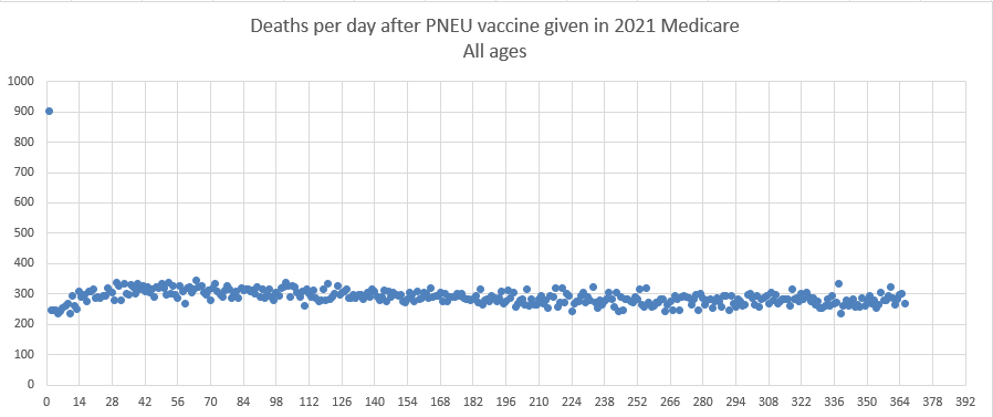
Pneumococcal vaccine curve (Medicare 2021 all ages)
This is the pneumococcal vaccine curve from Medicare in 2021. All ages. It looks at people who were vaccinated sometime in 2021 and looks for 1 year after the shot to see if they died. The x-axis is the days relative to the shot day that they died.
The pneu vax is given throughout 2021. Follow-up is 1 year from the shot date for each person. Age stratifying the results shows the same shape for both vaccines. So 65-75, 75-85, and 85 and up is same shape, just different height and more negative slope for the older cohorts. There are fewer total people who got this shot (it is not an annual shot), so that is why the absolute death numbers are smaller. But 300 deaths per day is plenty to establish a signal with very little noise as you can see from the chart.
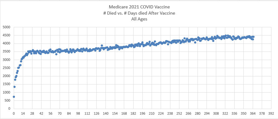
COVID vaccine curve (Medicare 2021 all ages)
This is the exact same chart as above, but this time for the COVID vaccine and tracks the days till death from their first shot (if they had >1 shot in 2021). Do you see the problem? The slope is positive. It’s supposed to be negative.
This is not a small subset either. For example, as of December 12, 2023, approximately 79.8% of Medicare beneficiaries have received at least one dose of a COVID-19 vaccine. This figure comes from the Centers for Medicare & Medicaid Services (CMS).
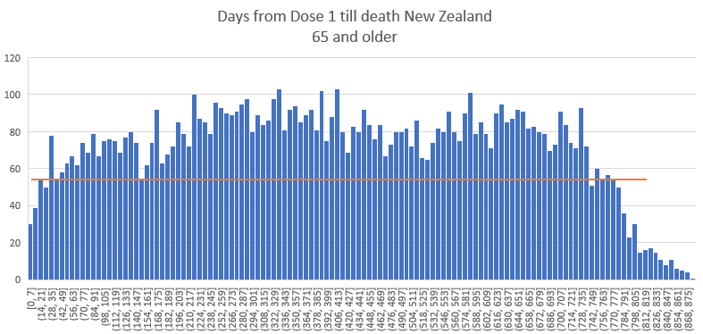
The New Zealand version of the Medicare chart
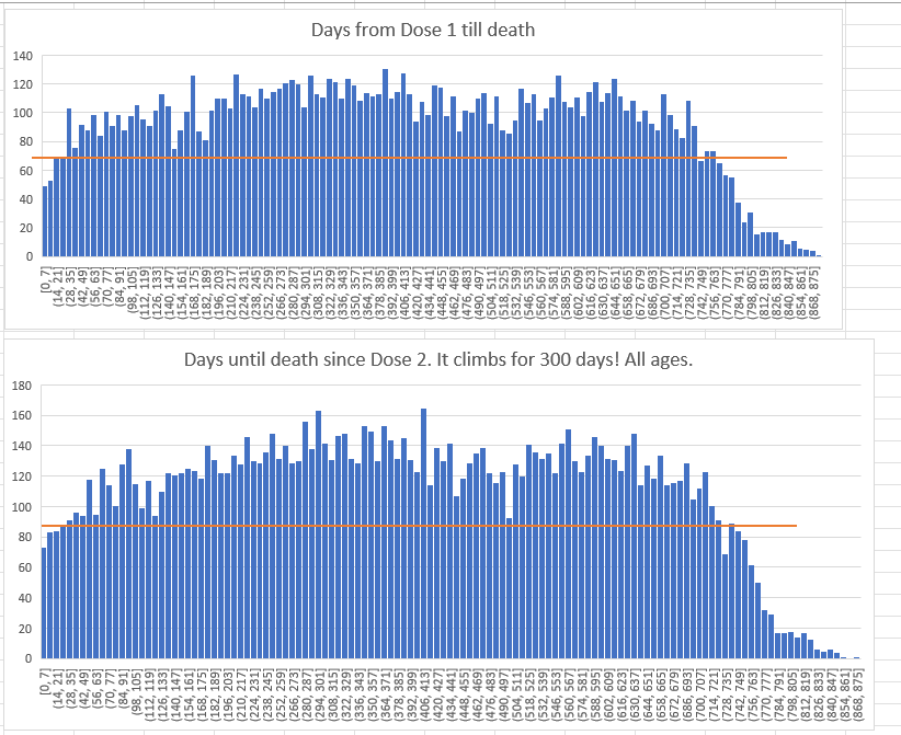
This is 65 and older in New Zealand for those getting Dose 1. The data is much noisier since there are way fewer deaths (the Medicare is deaths per day and this is deaths per week). Same effect seen of a mortality that increases for 400 days from the shot (generating new highs).
And here’s the chart for Dose 2

Could it be COVID? COVID deaths were on the order of 10 deaths per day in the full 5M population. In the graphs above, these are ~1M person cohorts, so any COVID effects would be on the order of 2 deaths per day which is 14 deaths a week.
But the curves for deaths after Dose 1 are all before COVID deaths started happening so the slope of Dose 1 above cannot be explained at all by COVID. Also, the shape of the COVID death curve is not monotonically increasing, but relatively flat.
Analysis
This isn’t rocket science.
The pneumococcal vaccine slopes downward exactly as expected from 308 average down to 288, a decrease of 6.5% over one year.
The COVID vaccine monotonically slopes upward from an average 3492 deaths per day after the shot to 4365 deaths per day, an increase of 25% over one year.
This is stunning. It is unprecedented.
The COVID vaccine is supposed to slope down like every safe vaccine as noted in the introduction. It’s a law of nature. Monotonically sloping upward over a one-year period has never been seen before. It is inexplicable. There is no background event that could cause this to happen. Most of the COVID shots for the elderly were given over a concentrated period of time (in the first 3 months of the year).
The New Zealand cohort time-series plot: the “smoking gun”
Additional notes to what was stated above:
- We use as a comparator the rate at week 5 since HVE is over by week 3. So this is conservative.
- The reason it peaks at 6 months is because that’s when the age mix of the cohort changes: Elderly people start recycling to the next dose leaving a cohort which is much younger causing the mortality rate due to the lower age of the people left behind (it also leaves behind stragglers that die at a higher rate).
- The “smoking gun” is that if we look at doses 2 to 6 and plot that we see the mortality rate climbing 49% over the next 5 months which is unprecedented. That’s the smoking gun that nobody can explain. This is a HUGE signal and it’s averaged over doses 2 to 6 so if there was a background effect, it would be diluted due to all the doses. What’s happening here is an amplification of the signal with each dose.
- If the cohort consisted of all 100-year-old people, we’d expect to see less than a 7% increase over the 5 months due to the increased risk of dying as you get older. For 80-year-olds, it’s an increase of 3.75%.
- If we restrict our age range to 0 to 70 (which covers 70 to 79 year olds), we have 715/420 which is a 70% increase, when we should have seen less than a 3.75% increase (80 year olds die at a rate of 66 deaths per 1K person years vs. 81 year olds at a rate of 72, so that’s how you get the 3.75% increase in 5 months if everyone is age 80; it’s 9% over the year but we are just looking over 5 months). This is the “smoking gun” and it is astonishing to me how many people missed this (like everyone). If this isn’t a smoking gun, I don’t know what is
Discussion thread on X
See this thread. Professor Jeffrey Morris is unable to explain what is causing this.
Both COVID and PNEU vaccines are seasonal (the COVID vaccine was given in Dec 2020 -Mar 2021 to seniors), so if there is a background mortality event, you’d see it reflected in both curves, but neither has any fluctuations, so it isn’t a background event.

It isn’t a cohort selection effect either. If anything, the pneu vax cohort would be bias since it is a small subset. But it behaves exactly as expected with a negative slope.
The COVID vaccine is basically offered to the entire population and it’s curve is anomalous, displaying a behavior that nobody has ever seen before. The flu vaccine is offered broadly to Medicare recipients, has a comparable deaths per day number (within a factor of 2) and does not exhibit the anomalous behavior (death curve with a positive slope). I age-stratified and checked the elderly.
So the effect we have with the positive slope is vaccine dependent, happens to a broad mix of Medicare recipients, only happens with the COVID vaccine, and has never been seen before.
I wonder what could cause it? I’m sure it must be some confounder that is unknown because it can’t be the safe and effective vaccine, right? ;).
Plots from New Zealand show the same effect
This is from the 66K spreadsheet in the data repository:
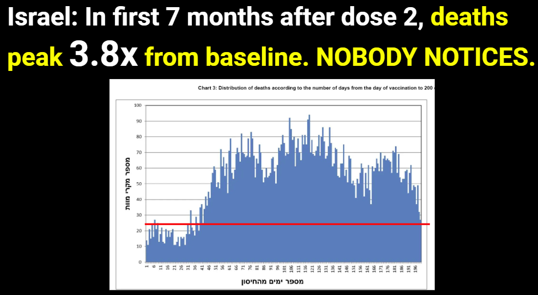
Plot from Israeli Ministry of Health: same effect
From my MIT presentation:
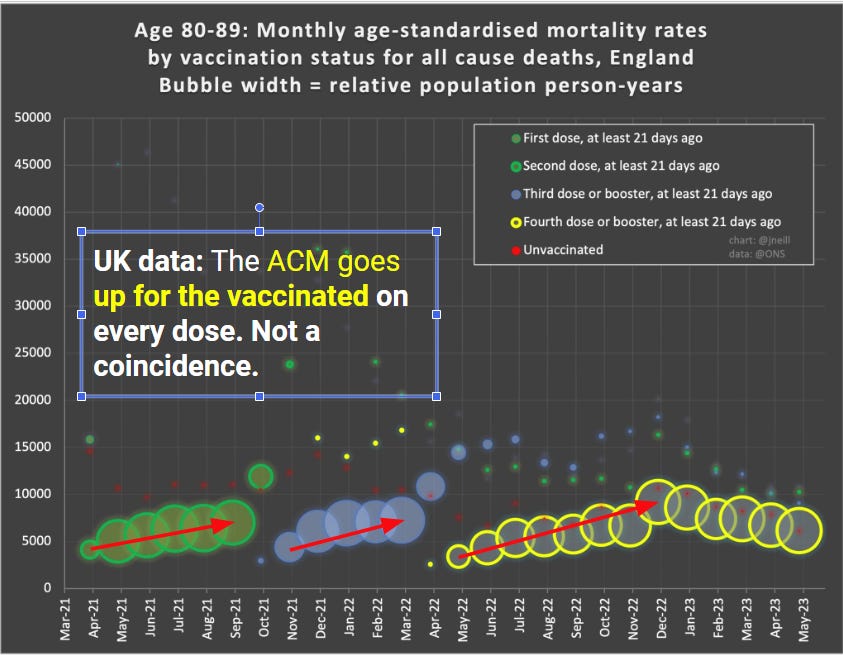
Plot from UK ONS: mortality goes up after the shots delivered
From my MIT presentation. Note that the UK ONS obscures the effect by choice of bucket size. So we can see it on a temporal basis by looking at 21 days ago over time.
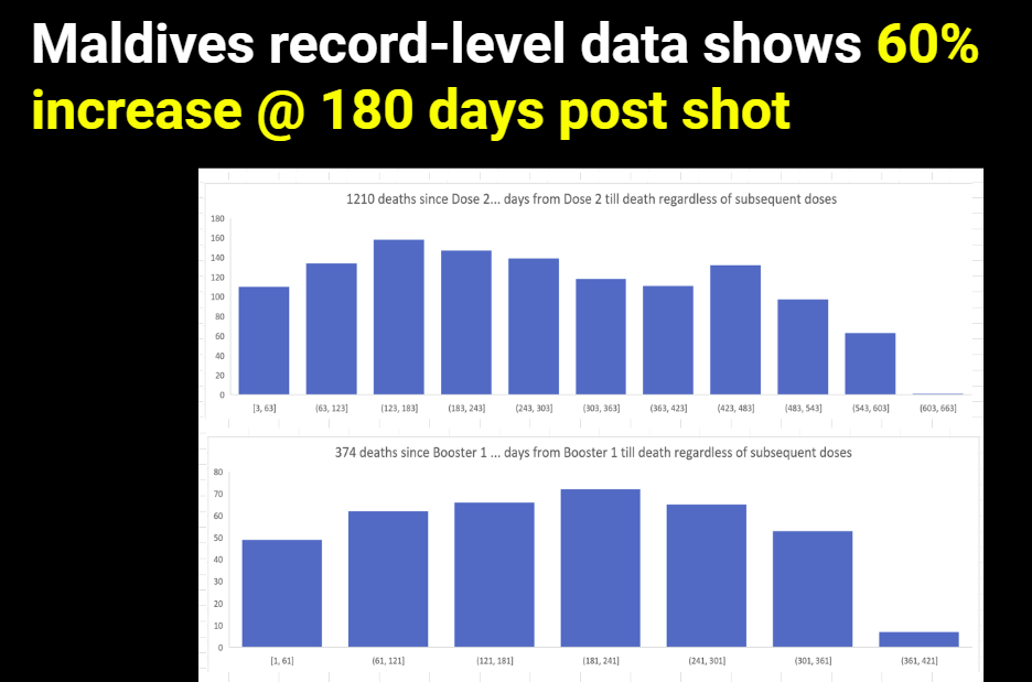
Plot from the Maldives: same effect
From my MIT presentation:
Is this proof that the COVID vaccine caused these deaths?
Here’s what we know:
- This effect has never been seen before (monotonic increase over 365 days since the first COVID shot). So it has to be caused by something novel, not in existence before 2021.
- It is not a background effect or we would have seen it in the pneumococcal vaccine
- The medicare queries that we run for both graphs were identical except for the vaccine, so it isn’t a coding artifact.
- The effect is ONLY seen for the COVID vaccine.
- The effect is correlated to the administration of the COVID vaccine.
- Increasing mortality by a 30% differential is huge. What it is causing this had to have been injected into people because nothing external kills people like this.
- The effect is happening in every country I have COVID vax data on.
If it wasn’t the COVID vaccine causing the increase, then what was it that fits all the parameters listed above? Nothing. That’s the proof. There is simply no other explanation.
But of course, we have tons of data that the COVID vaccines kill people, so this really wasn’t a surprise.
Are there any safe vaccines?
Not that I’m aware of. A safe vaccine would kill fewer than 1 person per million.
The pneumococcal vaccine easily exceeds that threshold on Day 0.
But the remainder of the death curve appears as we would expect a safe vaccine to look (if there was such a thing).
Why doctors will ignore this
Doctors need to earn a living. If they speak out about the vaccine, they will be fired and/or have their board certifications revoked.
So they have to lie to their patients. It’s self-preservation. Dissent simply isn’t tolerated. If you don’t toe the line with consensus thinking, you’re out.
So the killing will continue indefinitely because doctors are muzzled. That’s just the way it goes.
Summary
The longer the mainstream media, Congress, health authorities, and the medical community ignore this data in plain sight, the more clear it is that they are corrupt.
That is raw data, unprocessed. No tricks. No Simpson’s paradox. Same year. Same query. Different vaccines and dramatically different outcomes. It is simply unexplainable if the vaccines are safe.
Please share this article with your doctor and ask them to explain the two death charts to you and tell you why they believe that both vaccines are safe. Then, ask them what an unsafe vaccine would look like. Please record the conversation and post it.
Andre Picard, health columnist at The Globe and Mail in Toronto, Canada’s newspaper of record, called the life expectancy drop — to 81.3 years in 2022 from 82.3 years in 2019 — “a big deal.”
“It’s only the second time this sharp a drop has happened in Canada in the past century,” Picard said. “In fact, life expectancy has been climbing steadily for decades: 71 in 1960, 75 in 1980, 79 in 2000 and 82.3 in 2019.”